Branding · Packaging
Alunia
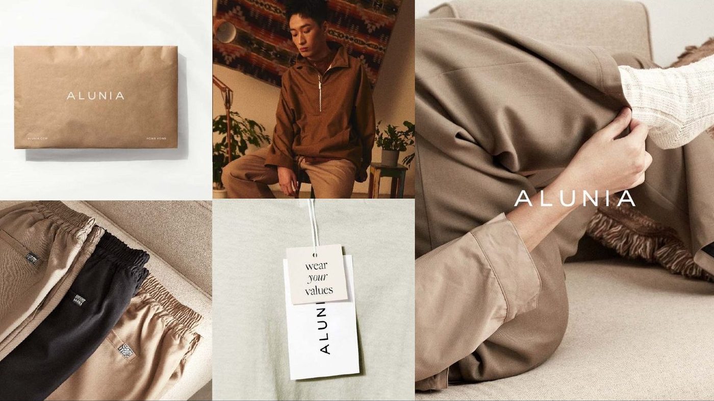
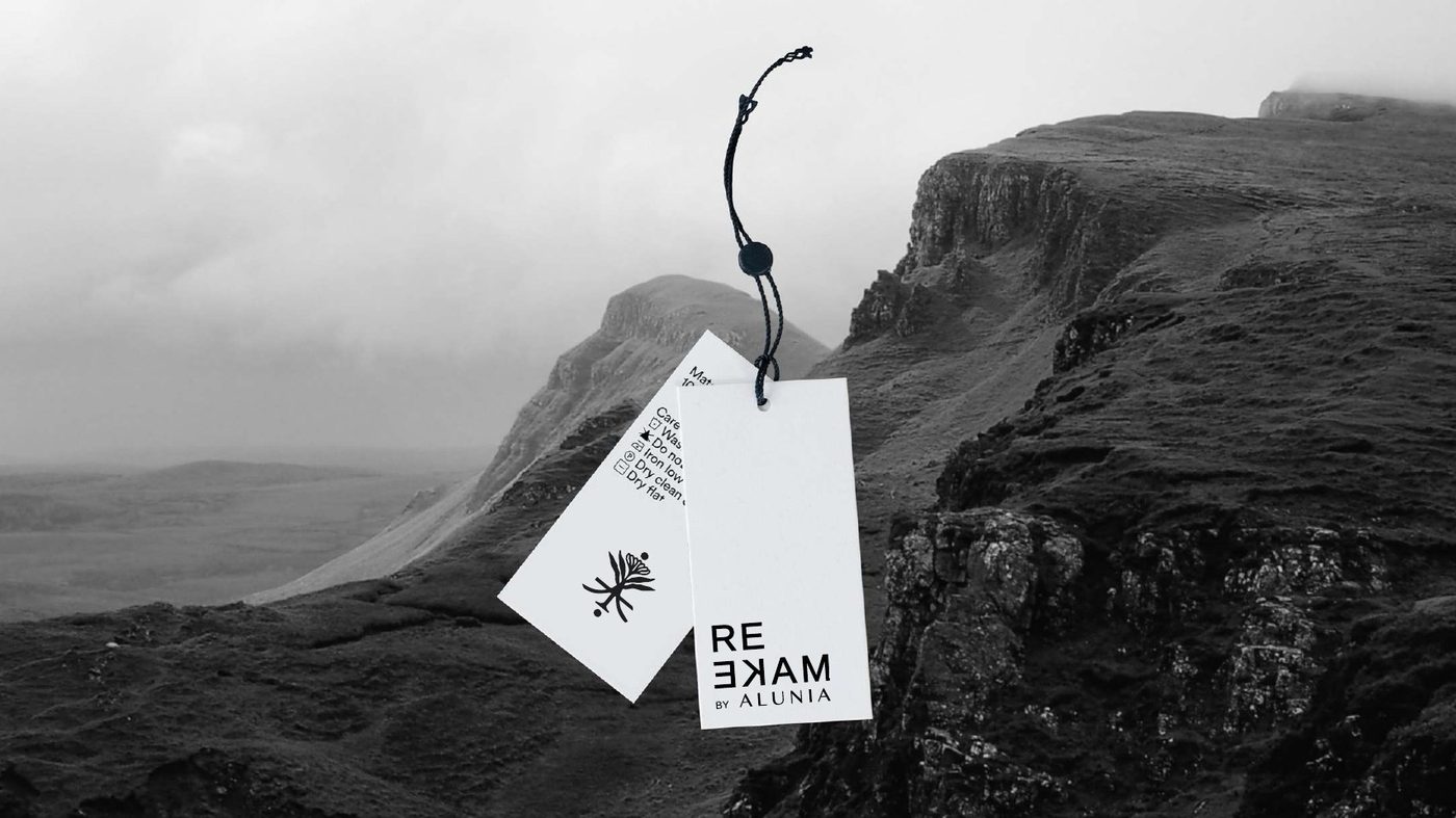
A clothing label built on reuse. The identity had to carry that idea without ever announcing it — so the mark reads the same reversed as upright, and the care label became part of the story rather than a legal requirement.
First edition
A space to explore and discover.
What we did
An identity that had to survive being turned inside out.
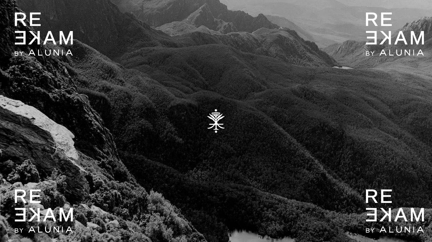
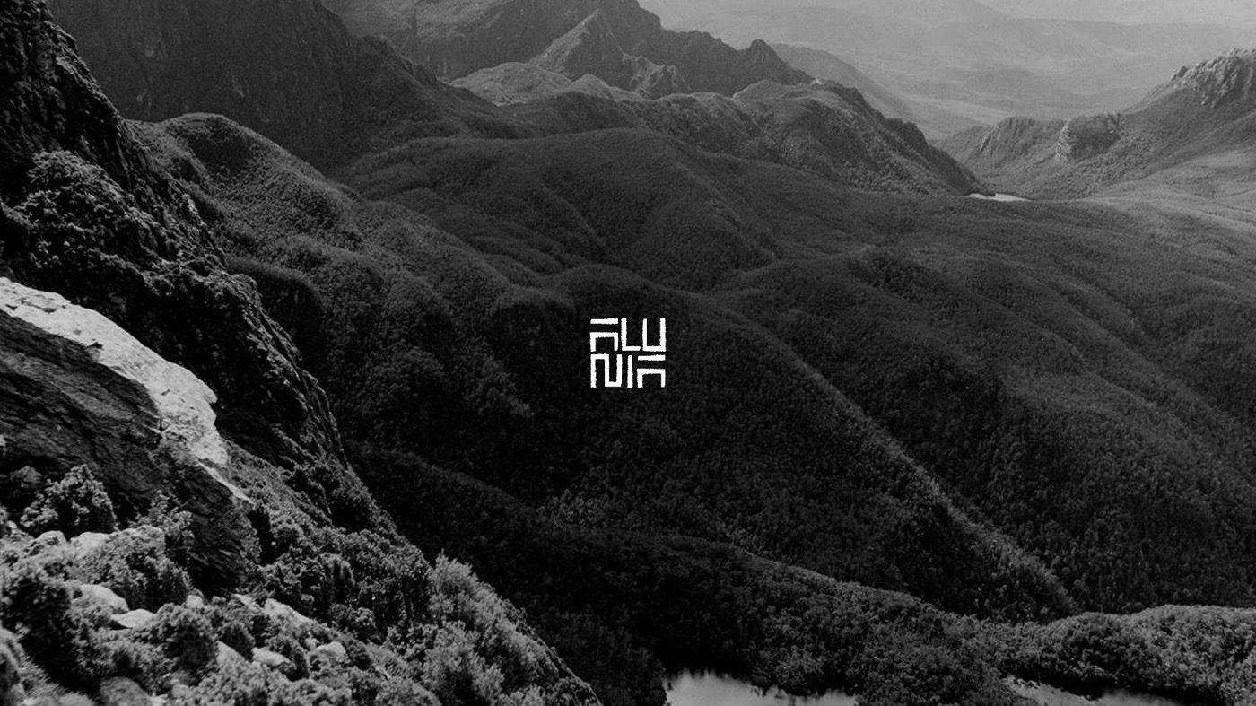
Alunia’s own line is called REMAKE — garments rebuilt from existing cloth. The mark was drawn to mirror: set it upright or flipped and it still reads, which is what let it sit on a woven label, a hangtag and a mountain photograph without redrawing it each time.
The type system runs in three voices. Liberation Sans, remade by Alunia, carries the titles. TT Commons handles description and detail. Organic OL Radiant Slender is reserved for the botanic dye laboratory — the part of the range where the colour is never twice the same.
The reference material stayed deliberately narrow: vintage, heritage, culture, history. Indigo, worn denim, raw hardware, cold light.
- Brand mark and reversed lockup
- Three-weight typographic system
- Woven labels, hangtags and care labelling
- Packaging and mailers
- Lookbook art direction
- Botanic dye sub-brand
Next project