
Branding · Packaging
TATA Mate
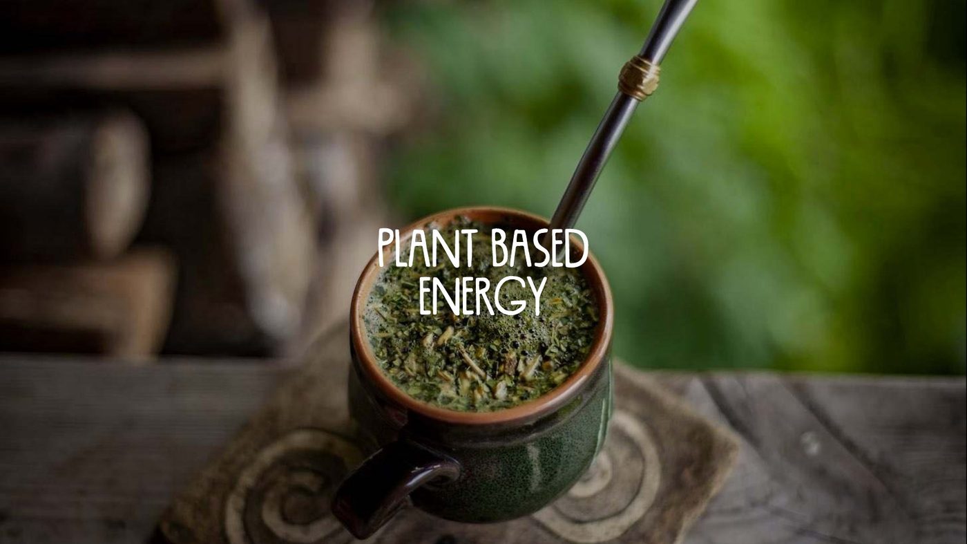
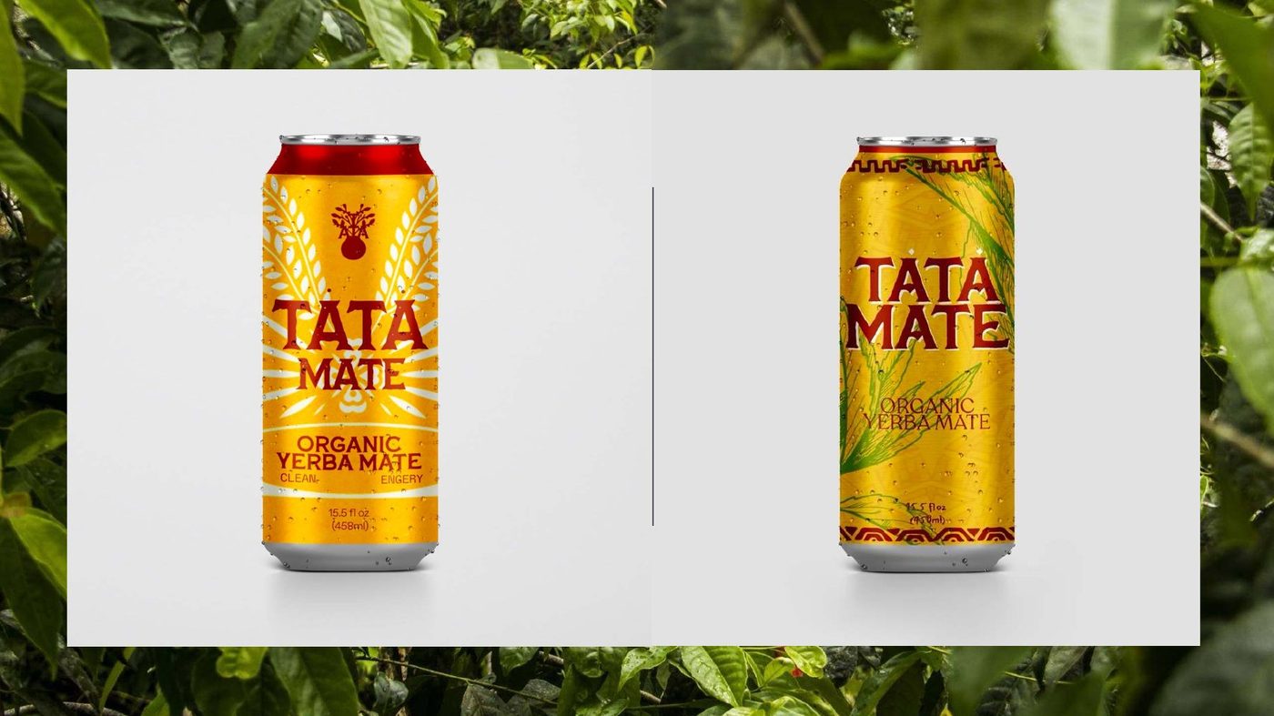
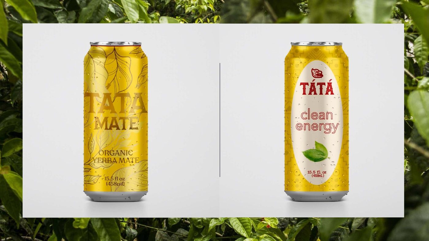
Yerba mate sold as plant-based energy. The work had to hold together across glass and aluminium, across four flavours, and still be readable from the far side of a chiller cabinet.
The promise on the front
Plant based energy.
What we did
One system, two formats, four flavours.
The mark is set as TÄTÄ over mate — the diaeresis doing the work of a logo so the name survives being printed small on a can seam.
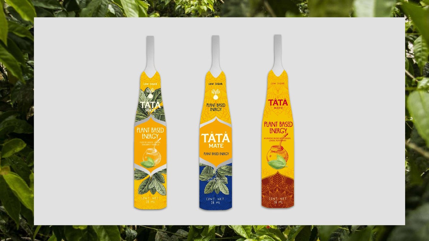
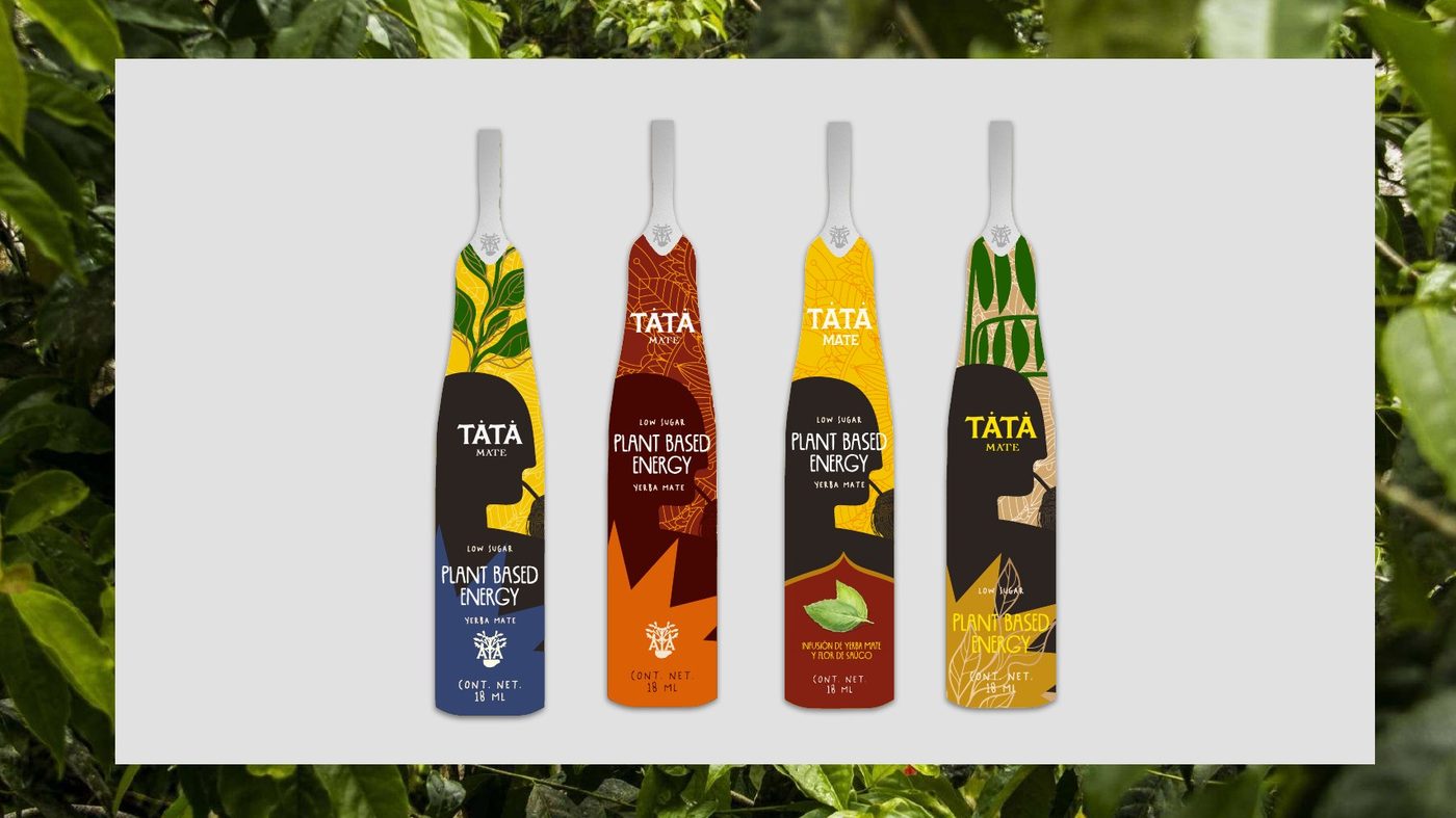
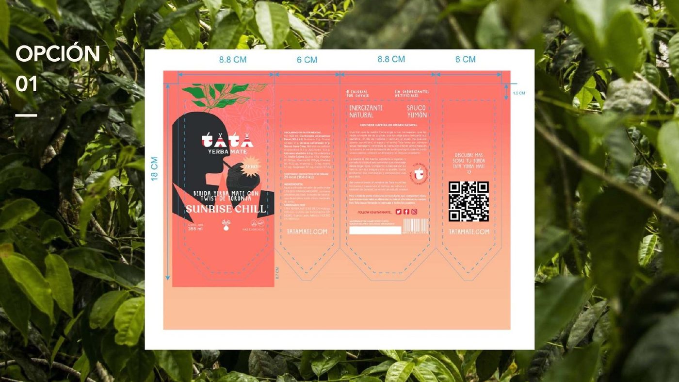
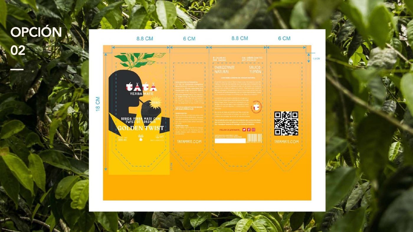
Flavour is carried by colour before it is carried by words: Sunrise Chill, Golden Twist, and the ayurvedic blend with ginger, lemon and peppermint. The Spanish line — flor de saúco, limón, jengibre y vainilla — sits under it at a size you only read once the can is in your hand.
Two packaging routes were taken to artwork so the client could see both against a real shelf rather than in isolation.
- Wordmark and botanical device
- Bottle range artwork
- Can range artwork
- Flavour colour system
- Two full packaging routes
- Retail-ready production files
Next project